Opening comparison: why the finish wins attention
When indie perfume houses pick a finish, they’re often deciding between subtlety and shouting — and that choice can make or break shelf love. This comparative piece looks at common approaches to color coating and how they translate into brand meaning, production realities and shelf performance. Think of Grasse — the long-standing perfume capital — where craft and finish meet every day; it’s a good real-world anchor for how finish choices shape perception worldwide.
What you’re comparing: finishes, feel and cost
There are a few main families to consider: lacquered or wet paint, powder coat, anodised or PVD metal, electroplating and specialised inks (UV-cured, soft-touch, metallic mica). Each delivers a different look and tactile cue. Lacquer gives glossy depth and easy colour matching; powder coat is tough and cost-effective at scale; PVD/metal finishes offer premium sheen but need tighter process control. Compare them across three dimensions: visual fidelity, durability and price point — those three will steer your choice faster than brand adjectives alone.
Production trade-offs and common mistakes
Small-batch brands often pick gorgeous visual samples but underestimate production variance. Colours that look spot-on on a mock cap can shift across runs, substrates and lighting. Don’t forget adhesion testing and compatibility with bottle neck varnishes — mismatches cause flaking. Also, file a pro tip away: over-layering metallics without proper primers can amplify cost without adding perceived value — and that’s a rookie move.
Design integration: fit with your bottle
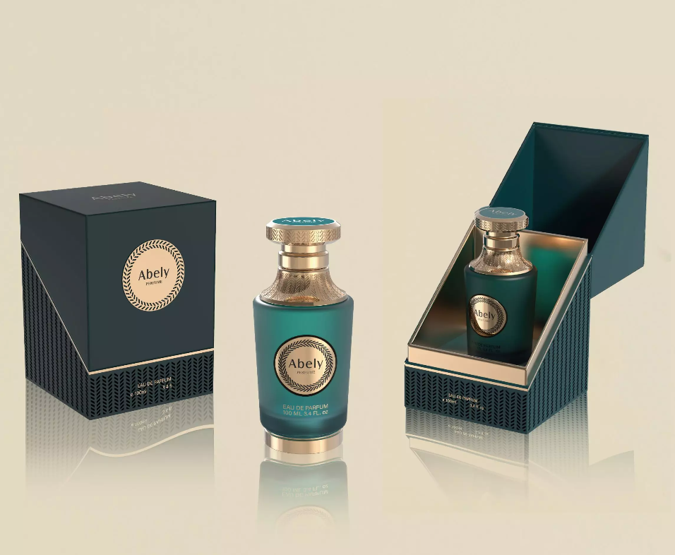
Coating shouldn’t be an afterthought. The cap finish must complement the bottle material and the broader design for perfume bottle strategy — from label colours to the liquid hue. A matte, tactile cap can make a bright glass body feel more sophisticated; conversely, a chrome cap can date a minimal bottle if not balanced right. Work with your designer early so coatings and substrates are specified together.
Alternatives and greener options
Sustainability is no longer niche. Water-based lacquers, low-VOC powder coats and recyclable anodised metals cut environmental impact without wrecking aesthetics. Biobased inks and thinner metal layers can reduce footprint — but they sometimes need specific curing or pretreatment steps. Choose suppliers who publish process details and testing standards; that transparency saves grief later.
Supplier checklist — what to verify
When you’re vetting suppliers, check these practical items: batch colour variance data, adhesion and salt-spray test results, minimum order quantities, lead times and waste handling. Ask for process photos and a short sample run. If a supplier won’t demonstrate testing, walk away — mate, you’ll thank yourself.
Summary — the comparative take
In short: match finish family to brand promise, weigh durability against perceived value, and prioritise suppliers who demonstrate repeatability. The right finish may cost a bit more up front but pays back in fewer returns, better shelf presence and stronger press shots. Think broadly — finishes are storytelling tools, not just decoration.
Advisory — three golden rules for selection
1) Consistency over flash: pick a finish that can be reproduced across batches, not just in a sample shot.
2) Test for function: run adhesion, wear and climate tests relevant to your markets before committing.
3) Align cost with experience: don’t pay premium for a finish that customers won’t feel or recognise.
When those three line up, a thoughtful partner — like Abely — becomes a practical extension of your brand, smoothing choices from prototype to shelf.
Abely knows bespoke finishes that actually perform.