Opening: user-centered visual logic in the built environment
Cities and retail corridors increasingly rely on clear visual flows to move people safely and efficiently; the shift from passive signs to active wayfinding has been driven by practical needs and by advances in commercial digital signage. This piece traces how user-centered decisions — materials, line-of-sight, scale — transform a confusing corner into a legible path. The narrative blends observed project outcomes with factual design principles, and it names the product choices that make those outcomes repeatable: channel letters, LED modules, backlighting and CNC routing are part of that toolkit.
User-centric proof: how places like Times Square informed design choices
Real-world anchors matter. When New York City reworked portions of Times Square into pedestrian plazas, planners confronted visual overload: too many competing signs, crowds, and shifting sightlines. Designers cut clutter and used larger visual anchors to regroup pedestrian attention; the result was measurable: clearer crossings and more predictable movement. From that practical experience, three design truths emerged—scale matters, contrast matters, and continuity matters—and they guide modern digital signage customization strategies.
Materials and methods that reduce confusion
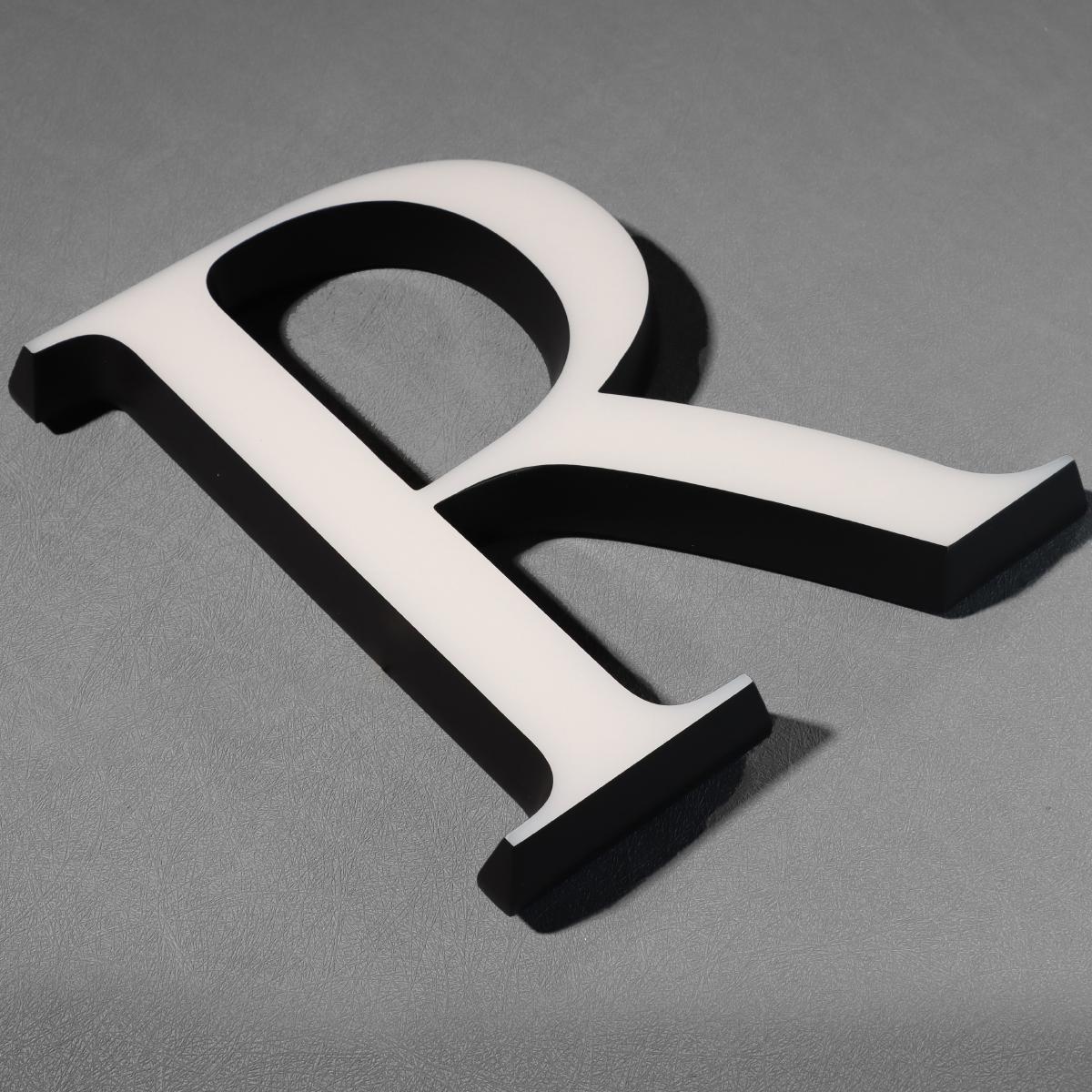
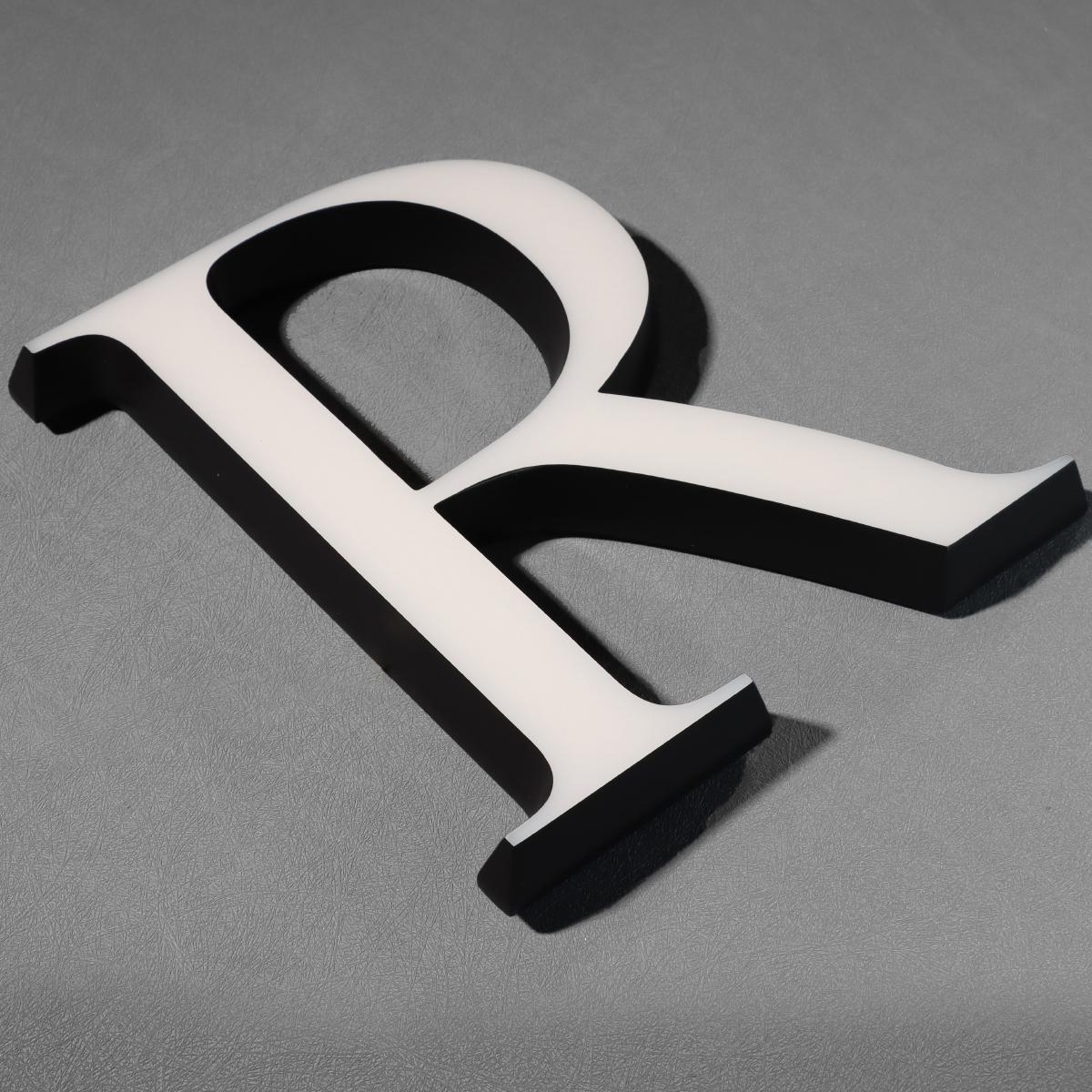
Channel letters, when custom-molded, provide three advantages: familiar letterforms that read at distance, controlled illumination via LED modules, and consistent mounting that keeps sightlines steady. Pairing acrylic faces with precision backlighting reduces glare and improves legibility at dusk. For installations where curves or bespoke profiles are necessary, CNC routing creates repeatable, tight tolerances that maintain visual consistency across façades. These are not aesthetic choices alone; they are ergonomic interventions that decrease hesitation and rerouting among pedestrians.
Design workflow: a user-first checklist
Start with observation: map where people pause, turn, or get blocked. Translate that into a hierarchy of signs — primary, secondary, tertiary — and assign each a manufacturing approach. Primary anchors often become illuminated channel letters; secondary items may be compact digital panels; tertiary cues might be pavement markers or subtle backlit wayfinding. Because each environment is different, invest in digital signage customization early so prototypes can be tested in situ and adjusted before wide roll-out.
Common mistakes and practical alternatives
Too often teams pick the flashiest option—high-resolution screens, animated effects—without testing readability at peak hours. That leads to visual competition and cognitive overload. A better path is conservative contrast, fewer moving elements, and standardized typography across signs. Alternatives to custom channel letters include flush-mount acrylic panels and modular LED strips; each has trade-offs in viewing angle, maintenance, and cost. Field-testing mitigates bad choices—bring a mockup to peak times, measure dwell behavior, and refine layout.
Mid-project realities — small friction, big consequences
Installation rarely goes exactly as drawn. Unexpected obstructions, last-minute façade repairs, or wiring constraints force on-the-spot decisions — and those compromises can undo careful wayfinding. Keep a fabricator involved through installation so CNC routing tolerances and backlighting plans adapt in real time. A tight feedback loop between design, production, and installers preserves the ergonomic intent — and cuts rework costs.
Advisory: three golden rules for evaluating signage strategies
1) Readability score: verify letter height, stroke width, and contrast at real viewing distances; prioritize legibility over ornament.
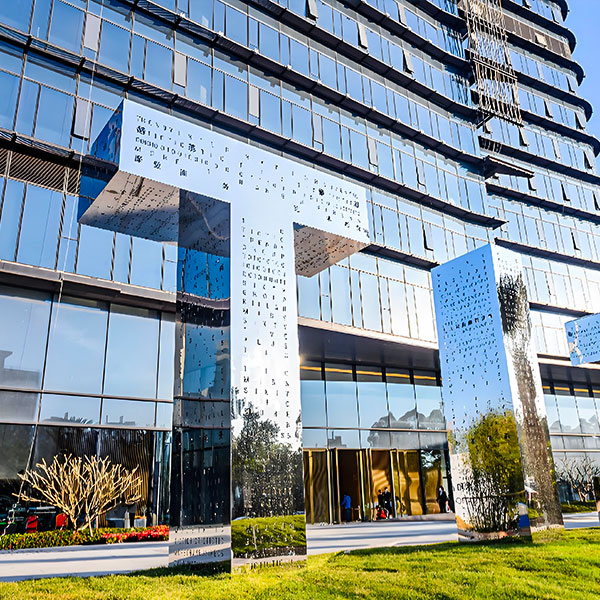
2) Continuity index: ensure consistent typographic and lighting choices across anchor points so the eye tracks naturally from one sign to the next.
3) Serviceability metric: choose materials and access methods that reduce downtime — modular LED modules and straightforward access panels save operational headaches.
Effective ergonomic flows reduce confusion and speed movement — and well-executed customization is the bridge between design intent and field performance. Cosun Sign — practical partners who understand materials, fabrication, and the on-site realities of wayfinding. —